When the page should feel chosen, not standard
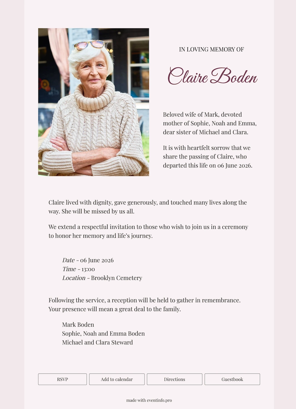
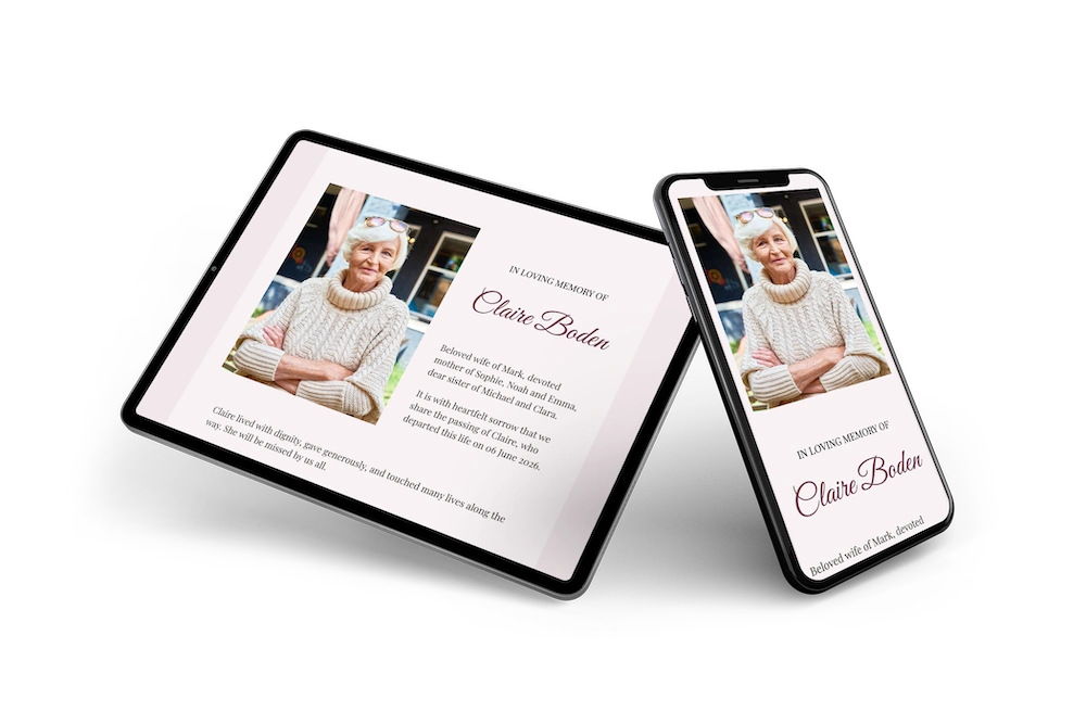
A digital farewell like this online funeral card carries the announcement, the service details and a place for condolences behind a single link. The design keeps to one accent. Plum appears only in the script of the name, while the pale blush background and dark grey text do the rest. Placed next to a portrait photo, the result feels like a personal choice rather than a template, which suits a family with a clear sense of taste.
Recipients let you know whether they will come to the service or the reception afterwards, so you have a sense of numbers. They also open the route and add the date to their calendar from the same page. Prefer something plainer? Our other online funeral cards hold back even further.
Create your own online funeral card
Use this design as a starting point and create a fitting funeral card within minutes.
Frequently asked questions
How quickly can it be ready?
Half an hour. The layout is complete, so the time goes into the wording and the photograph rather than the design.
What can recipients do?
They leave a message of condolence, open directions to the service and note the date. Everything sits on one page, so nobody has to hunt through a thread for the address.
Why only one accent colour?
A single accent reads as a decision, while several read as decoration. On a page that has to stay serious, one restrained note of colour does more than a border or a flourish would.
Can the accent be changed?
Yes, along with the typefaces, the photograph and every line of text. The portfolio shows what else is available.
What does it cost compared to printing?
No print run, no postage and no reprint if a detail changes. In the days after a death, correcting a page is worth more than the saving itself.
Design details: fonts and colors
Fonts
- Header 1 — Playfair Display
- Header 2 — Great Vibes
- Text — Playfair Display
Colors
- #484440 — Header 1
- #6e4050 — Header 2
- #484440 — Text
- #f8f2f4 — Card
- #f2e8eb — Background
Use this design
Copy this design to your dashboard to use it as a starting point.
All example invitations are fictional. Photos of people are AI-generated; illustrations are licensed or AI-generated.