Choosing background colors
Choosing background colors
The right background colors make your invitation look polished and professional. In Eventinfo.pro you can set three types of colors: the Card color, the Background color, and the Text highlight for individual words or sentences.
1. Card color
The card color is the background behind your text and photo. This is the canvas of your invitation. Choose a shade that matches your photo and the mood of your event.
- In the editor, click on Card.
- Select a color from the palette, enter a hex code, or use the eyedropper to pick a color from your photo.
- Check the result right away in the preview.
2. Background color
The background color fills the space around the card. On smaller screens this is not visible, but on larger screens it adds extra style to your invitation.
- In the editor, click on Background.
- Choose a color via the palette, a hex code, or the eyedropper tool.
- Try a color that either contrasts with or complements the card color.
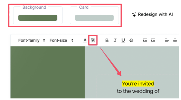
3. Text highlight
Want to make certain words or sentences stand out? You can add a background color behind text, similar to highlighting in Microsoft Word.
- Select the word or sentence you want to highlight.
- Click the highlight icon in the toolbar (A with background).
- Pick a color from the palette. The text will be highlighted instantly.
Tips for a clean design
- Keep it simple: use no more than two main colors and one accent color.
- Prioritize readability: make sure there’s enough contrast between text and background.
- Match with your photo: use the eyedropper tool to grab colors directly from your photo for a harmonious look.
Get started
Experiment with colors in the editor. You can always go back and choose again until you find the perfect combination.
Last Update: 10 October 2025