Styling the buttons
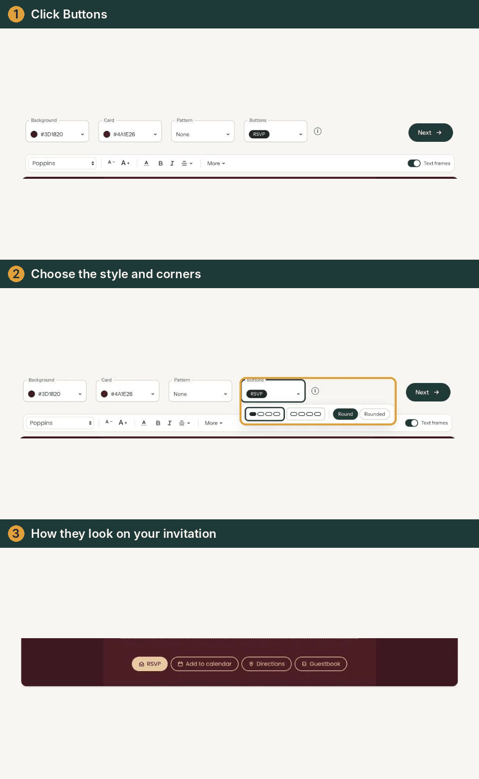
At the bottom of your invitation are the buttons for your guests, such as RSVP and Directions. You choose how they look in the builder, with the Buttons field. There’s no colour to pick: that adapts to your design.
How it works
- At the top of the builder, click the Buttons field, or one of the buttons at the bottom of your card. A small panel opens right below the field.
- Choose the style on the left. In the first example the RSVP button is filled (Highlight RSVP); in the second, all buttons only have an outline (All buttons the same).
- Choose the corners on the right: Round or Rounded.
- Click anywhere outside the panel to close it. Your choice is already saved.

Highlighted or the same?
With Highlight RSVP, the button guests use to say whether they’re coming stands out most. Useful if you want as many people as possible to reply. If RSVP is switched off, all buttons are the same automatically and highlighting isn’t available.
Round or rounded
As long as you don’t choose here, the buttons follow the corners of your photo: if Rounded corners is on for the photo, the buttons are round (Add or replace a photo). Once you choose here, your choice applies.
The colour
The buttons take a colour from your design, usually that of the names, as long as it stands out well against the card. If it doesn’t, they turn dark or light. Change the text or card colour later and the buttons follow automatically.

Which buttons appear isn’t set here but under Change details: Which buttons can you turn on?.
Last updated: November 11, 2026
- Designing your invitation: the basics
- Choosing a layout
- Choosing the background and card colour
- Using the colour picker and pipette
- Editing and formatting text
- Replacing the example text with your own details
- A new look in seconds with Redesign
- Undoing changes
- Moving and aligning text
- Showing or hiding text frames
- Adding a pattern
- Styling the buttons
- Adding a link to your text
- Adding a schedule for the day
- Customising a ready-made design
- Using keyboard shortcuts